FineArtDaily field note
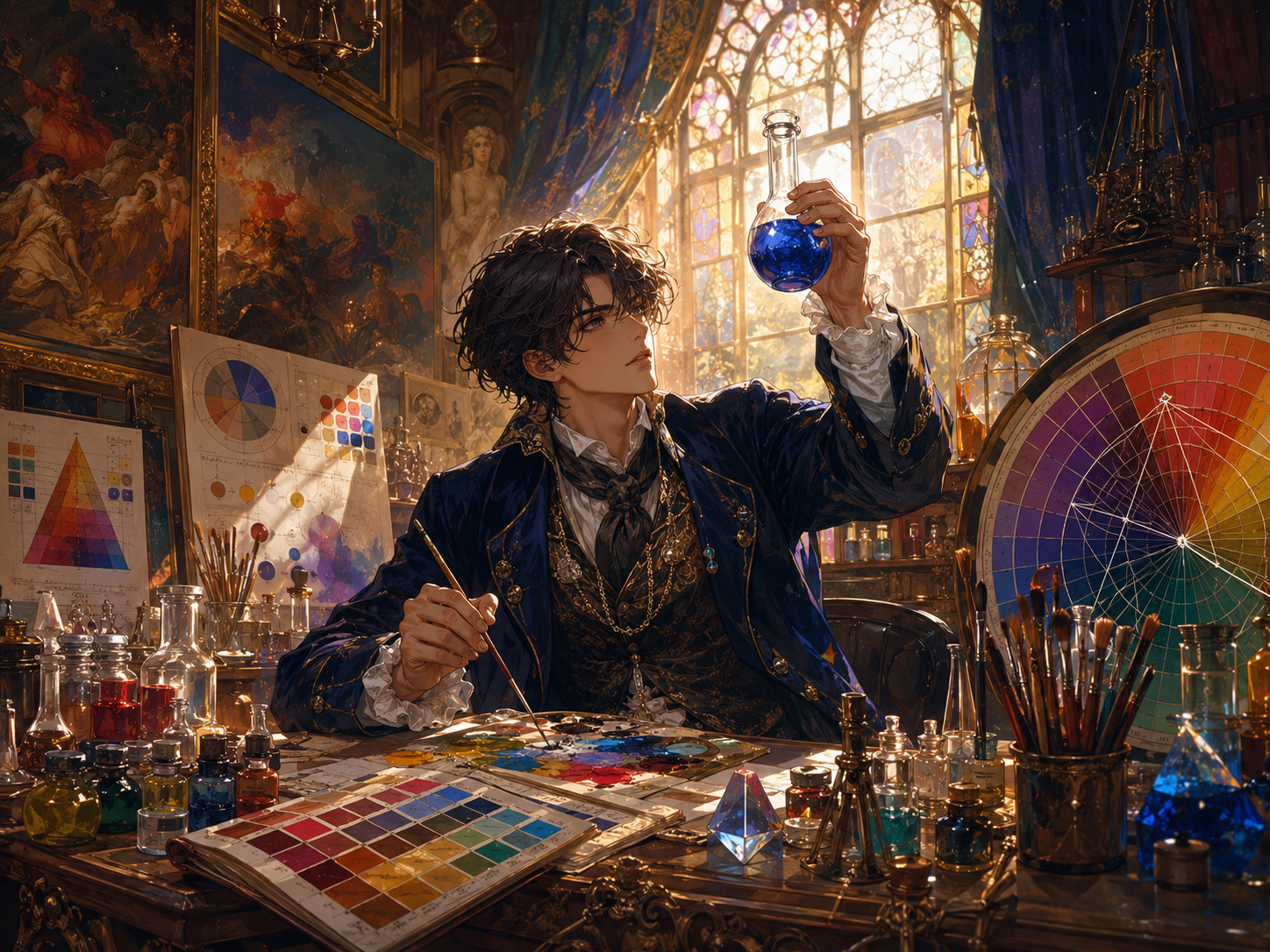
What color theory is
Color theory is the study of how colors relate, contrast, harmonize, and create feeling. It helps explain why one painting feels calm, another feels violent, another feels holy, and another feels like the Palette Goblin knocked over a fireworks cart in the museum gift shop.
For viewers, color theory is a shortcut into the painting. Before you know the artist, date, movement, or symbolism, color is already talking.
The three big controls
Most color decisions begin with three controls:
- Hue: the basic color family — red, blue, yellow, green, violet, orange, and all their cousins.
- Value: how light or dark the color is. Value controls structure, focus, and readability.
- Saturation: how intense or muted the color feels. High saturation shouts. Low saturation murmurs.
When a painting feels powerful, it is often because the artist is controlling all three at once. A brilliant red dress against a dim room is not just red. It is hue, value, saturation, contrast, and theatrical timing.
Contrast: the museum spotlight
Contrast tells your eye where to go. Artists use light against dark, warm against cool, dull against bright, and soft against sharp. This is why a tiny glow can dominate a huge shadow, and why a single blue note can feel electric inside a golden room.
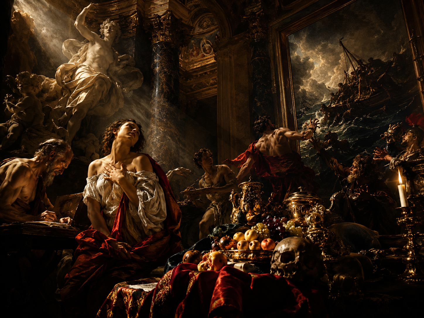
Light vs. dark
Chiaroscuro turns illumination into theater. The eye obeys the spotlight.
Warm vs. cool
Warm colors move forward. Cool colors often recede. The Goblin abuses this power.
Harmony: when colors agree
Color harmony happens when a palette feels intentionally related. A painting might use neighboring colors for calm, complementary colors for snap, or a limited palette for unity. Harmony does not mean boring. It means the colors know why they are in the same room.
- Analogous palettes use neighboring colors, such as blue, blue-green, and green.
- Complementary palettes use opposites, such as blue and orange, red and green, or yellow and violet.
- Monochrome palettes use one color family across many values.
- Limited palettes restrict the range so every color feels chosen.
Temperature: warm, cool, and sneaky
Warm colors often suggest sunlight, flesh, fire, closeness, appetite, danger, or attention. Cool colors can suggest distance, shadow, water, air, melancholy, calm, or mystery. But the trick is context: a blue can feel warm beside a colder blue, and a red can feel cold if it is pushed toward violet.
That is why color is not a fixed dictionary. It is a conversation.
Famous uses of color
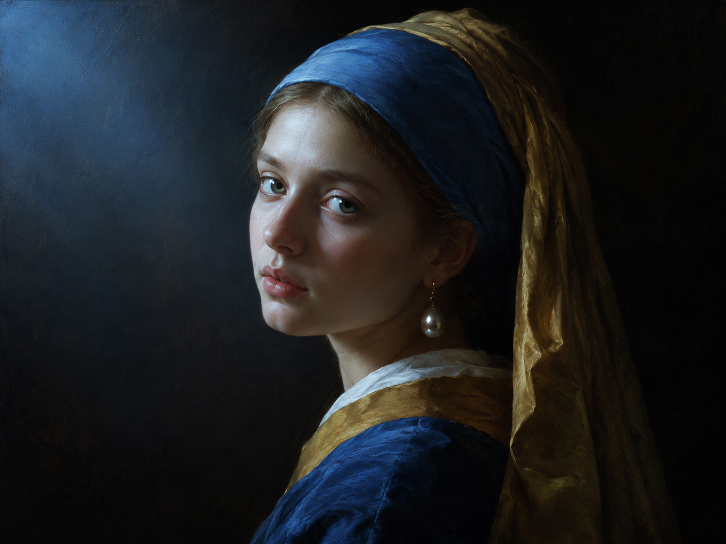
Blue light
Cool color can create quiet mystery, especially when paired with skin tones and darkness.
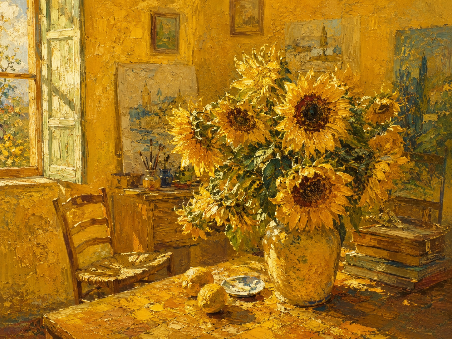
Yellow force
Yellow can feel joyful, devotional, unstable, or blazing depending on value and saturation.
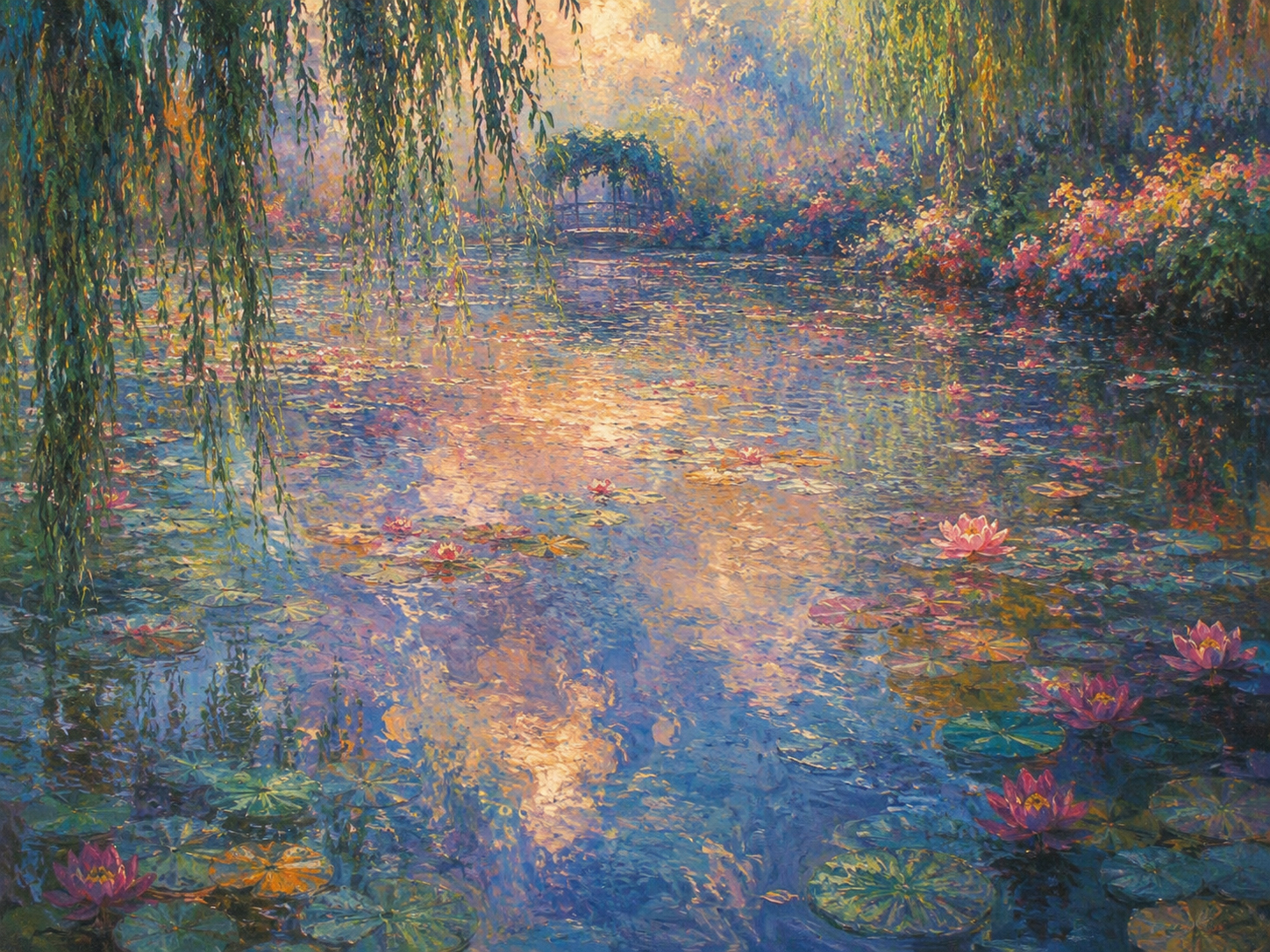
Reflection color
Water, sky, and garden colors can dissolve boundaries until the whole scene becomes atmosphere.
How to look at color in a painting
- Squint first. Find the big light and dark pattern before chasing details.
- Name the dominant color mood. Is the painting warm, cool, muted, bright, earthy, jewel-like, smoky, or acidic?
- Find the loudest color. Ask why the artist made that color the loudest.
- Look for the color that does not belong. That one may be the key.
- Ask what the palette makes you feel before reading the label. Your eye often arrives before your brain.
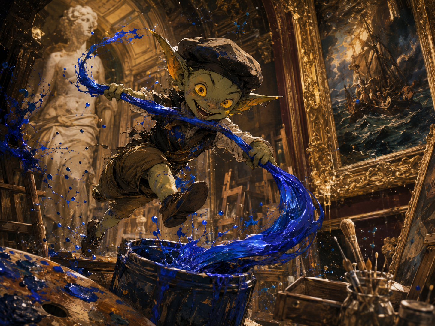
Palette Goblin rules
The Palette Goblin has three rules, and regrettably they are useful:
- One color may be the monarch. Too many kings ruin the kingdom.
- Gray is not failure. Muted colors make bright colors powerful.
- Contrast is seasoning. Enough gives life. Too much burns the soup.
FineArtDaily verdict
Color theory is not about memorizing a wheel. It is about noticing how artists steer attention, emotion, depth, and meaning through color relationships. The painting may be old, but the color is happening to you right now.
Next museum rooms
Now that the Palette Goblin has stolen blue, follow color into Modern Art, Abstract Art, Impressionism, and the larger movement timeline.